
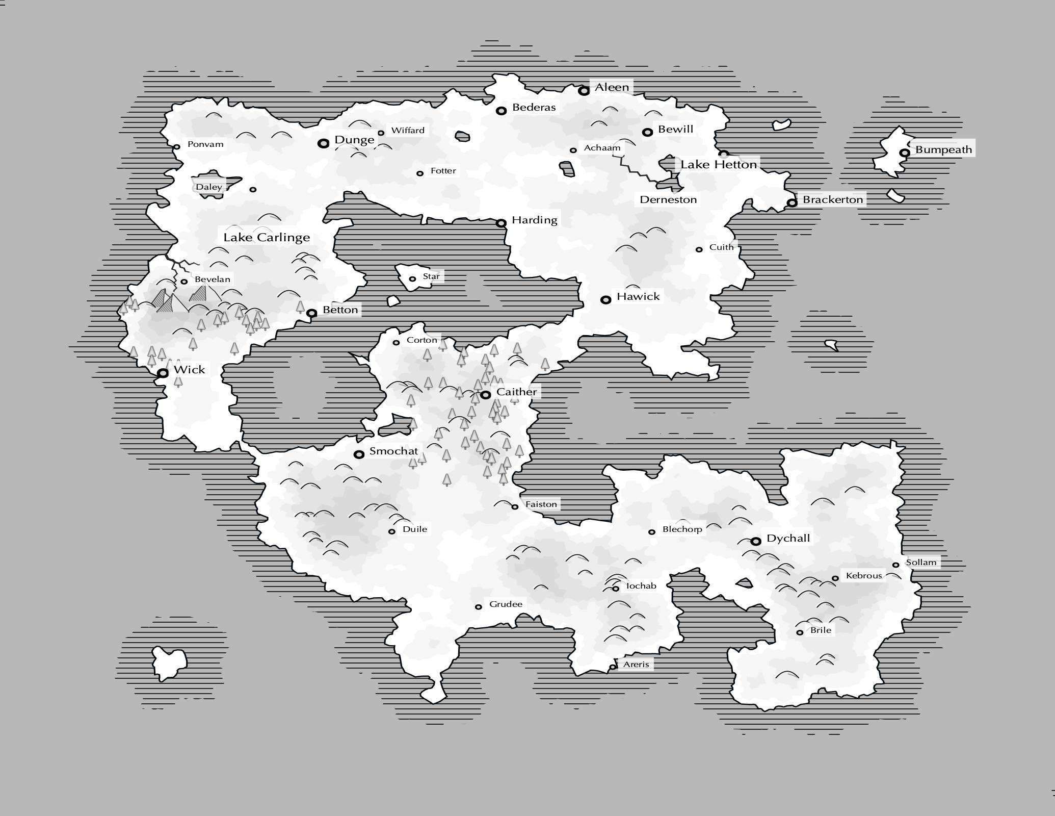
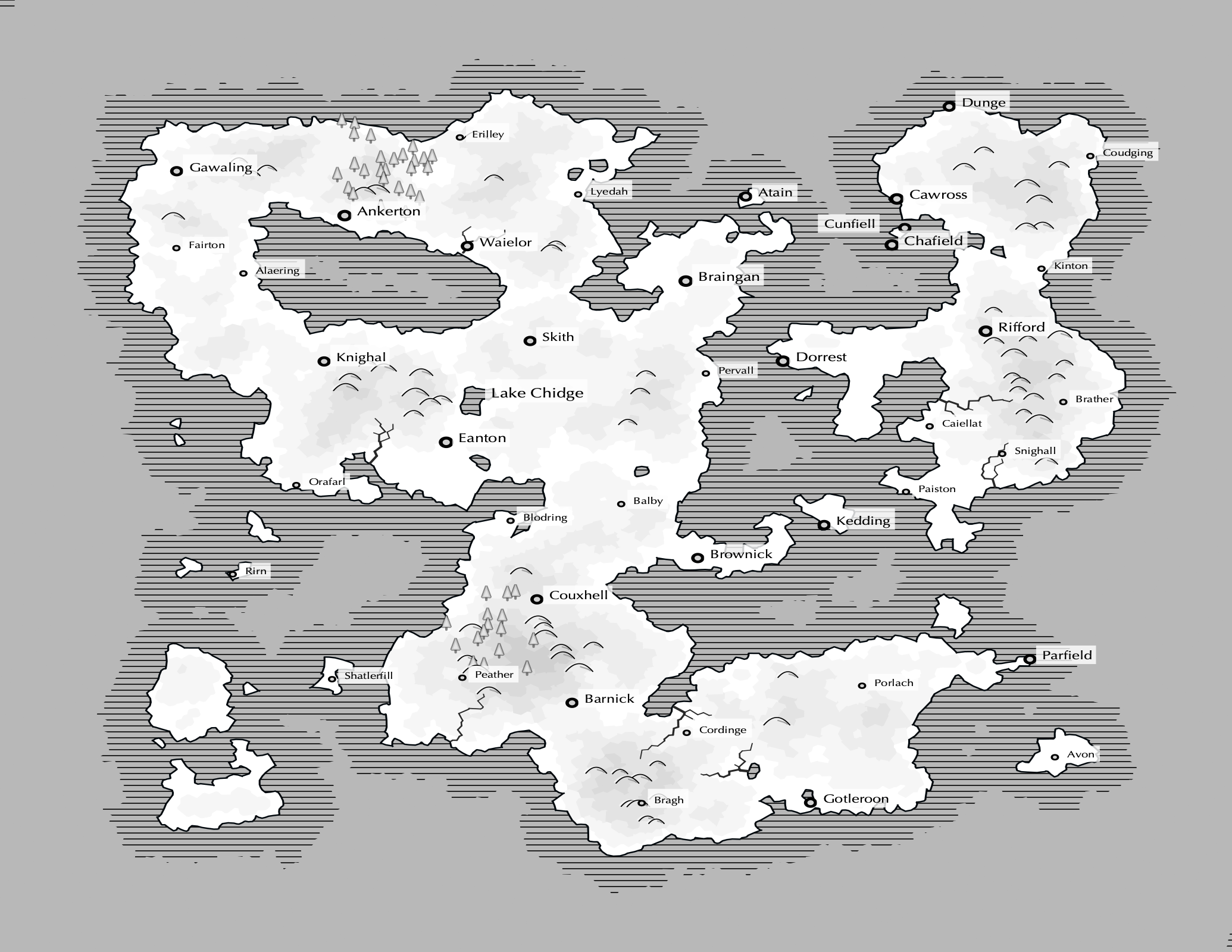
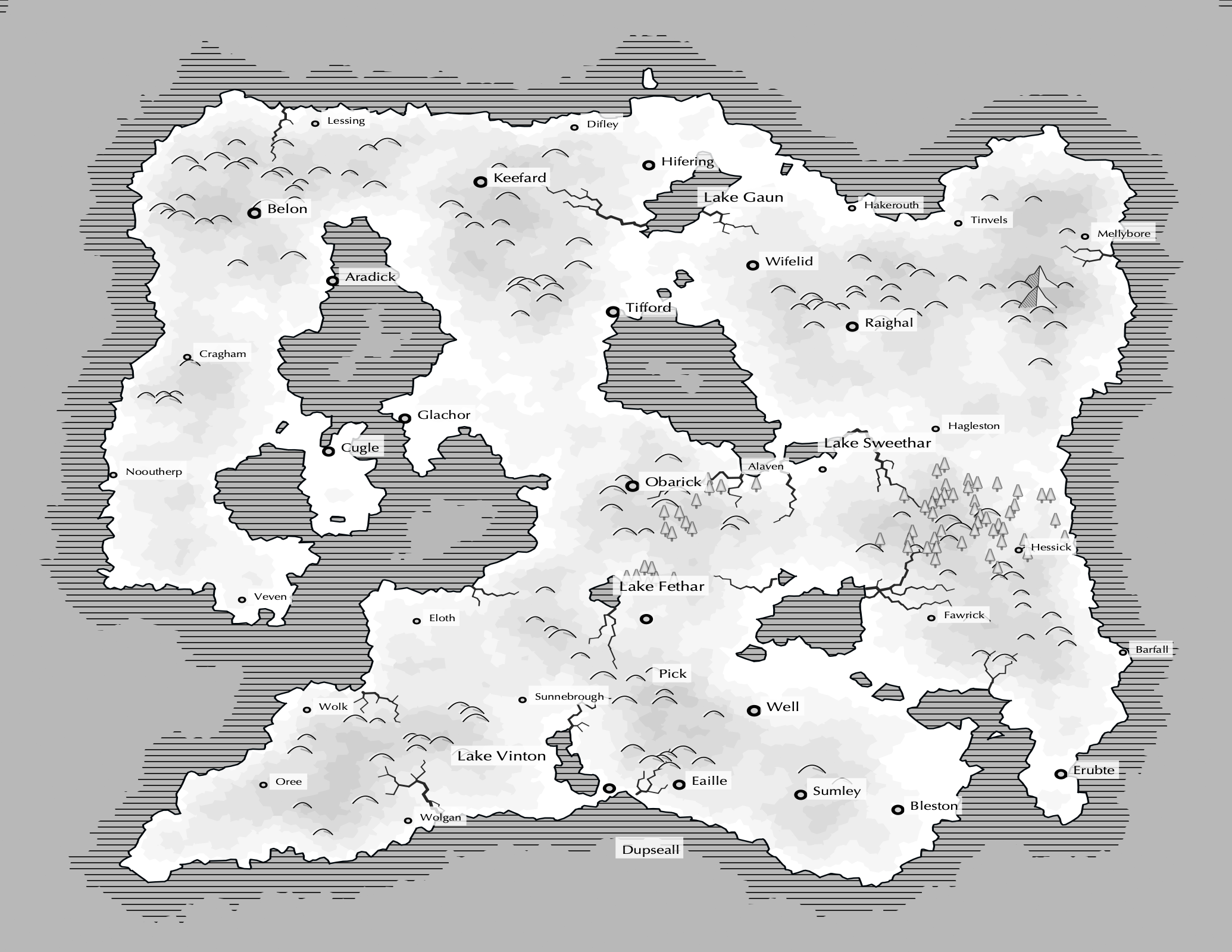
I'm happy to report that I've completed all pre-print features (!!). With the finish line drawing closer, the remaining work is in print and writing with a few quality improvements here and there. My last update was about six weeks ago, and here's what the latest version looks like:
 |
 |
 |
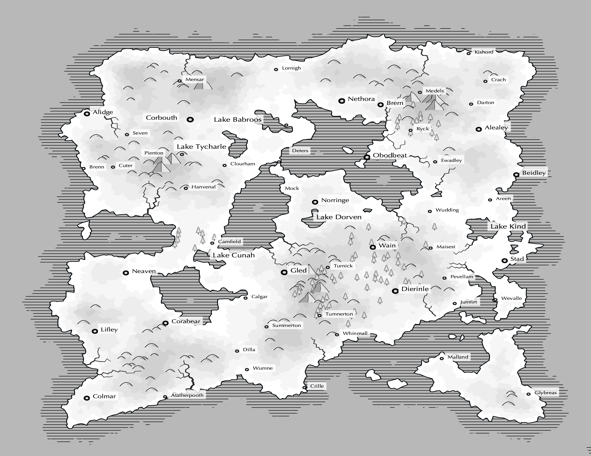 |
This version includes the features I had on my roadmap in my last update (variable city sizes based on population, a more print-friendly grayscale color scheme that uses shading instead of color, and a handful of visual rendering improvements). I also made some minor improvements to name generation that ended up having a surprisingly positive impact on quality – I'm rarely throwing out maps due to low name quality now, which was not true in Dec. A few highlights:
- Last night I added a feature that scales a city's label size based on its population; this makes denser maps with lots of labels look a lot better. Previously, maps that have 15+ labels that have no precedence looked like a mess, but the relatively minor change in label size is effective at drawing some contrast.
- I'm really happy with the shading on coastlines. This horizontal hatching style is fairly common in online mapmaking forums (yep, I visit those now) and I think it works well on my greyscale map style.
- I actually got city sizing working in a few hours and it works pretty well though I'm sure I'll improve it over time. In short, I'm using a relatively simple population model for each city that accounts for natural population growth and migration. The former takes into account a carrying capacity based on the land around the city (simulating how much food could be produced), making cities in better locations usually end up with larger populations. The latter simulates the movement of people to nearby, more desirable locations which typically prevents many large cities from existing beside each other. More info is coming to the project wiki if you're interested.
I also spent some time on iconography this month, which felt necessary after transitioning to grayscale; the grayscale maps without iconography looked pretty flat. I'm still not happy with the iconography that exists, but I'm not sure its worth putting more time into prior to printing since iconography is slow-going for me.
Next up
This week I'm going to send some sample maps to Fedex to print out on a few different paper weights and colors to determine the requirements for the full print. Once I've confirmed that I'm happy with how the maps look on paper, I'm going to start working on layout while I pass some maps over to the writers I've identified. With any luck, we can get everything put together to ship to the printers without much struggle.
Though I'm sure more surprises will pop up, I feel fairly close to the finish line for this phase of the project!